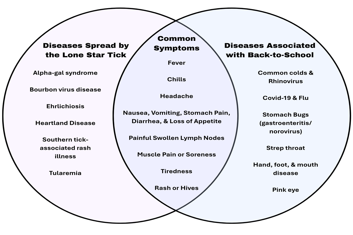
When we communicate about vector-borne diseases, there is often a lot of information we want people to know. We may need to explain how a disease is transmitted, how to identify a vector, what symptoms to look for, where risks are highest, or what steps someone can take to protect themselves. All of this information may be important, but providing accurate information does not necessarily mean that information will be understood.
This is where health literacy and design intersect.
Health literacy is often associated with an individual’s ability to find, understand, and use health information. But the responsibility for understanding should not fall entirely on the person receiving the information. As communicators, educators, researchers, and designers, we also have a responsibility to make health information easier to access and understand.
Design plays an important role in that process. Typography, hierarchy, imagery, language, layout, and the organization of information all influence how easily someone can make sense of a message. This is particularly important in public health, where we are often asking people not only to understand information, but to act on it.
When developing vector-borne disease communication, there are five principles that can help us design for understanding.

Prioritize the Action
One of the first questions we should ask when creating health communication is: What do we want someone to do after seeing this?
Consider a piece of educational material about mosquito prevention for pest control operators. There may be a great deal we could explain about mosquito biology, larval habitats, disease transmission, or control methods. But if the primary goal is to support effective treatment in the field, the most important message may be to identify and address mosquito larval development sites before applying control measures.
That action should not be buried beneath several paragraphs of background information.
This does not mean the supporting science is unimportant. Instead, it means we should consider the order in which information is presented. Give people the most important information first, then provide the explanation and supporting details they need to better understand why the action matters.
Reduce Cognitive Load
Vector-borne disease communication can become complicated quickly. Scientific terminology, unfamiliar species names, disease transmission pathways, statistics, prevention recommendations, and pesticide information can all compete for a reader’s attention.
Every additional piece of information requires some amount of mental effort to process. When too much information is presented at once, audiences may have difficulty determining what is important.
Reducing cognitive load does not mean oversimplifying the science. It means making the science easier to access.
Information can be divided into smaller sections, related ideas can be grouped together, unnecessary content can be removed, and technical terminology can be explained when it is necessary. Headings, short sections, lists, and progressive disclosure can also help audiences move through complex information without having to process everything at once.
Establish Clear Hierarchy
Imagine someone encounters a vector-borne disease poster at a community event or sees a graphic while scrolling through social media. They may give it only a few seconds of attention.
What should they understand first?
What should they notice next?
What information can they discover if they choose to keep reading?
These questions are at the heart of visual hierarchy. Size, weight, spacing, placement, contrast, and repetition can help communicate which information is most important and guide the audience through the content.
A useful way to think about health communication is to divide information into three levels. Primary information is what someone absolutely needs to know. Secondary information helps them understand the message or take action. Supporting information provides additional explanation, evidence, or context.
Not every piece of information needs to have the same visual weight. When everything looks important, it becomes difficult to determine what actually is.
Use Visuals to Explain, Not Decorate
Visual communication can be particularly valuable when explaining complex health information, but simply adding an image does not necessarily make information easier to understand.
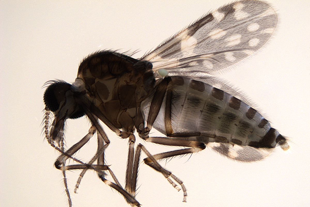
A photograph of a mosquito may make a fact sheet more visually engaging. A diagram showing where mosquito larvae are likely to develop around a home, however, can help someone identify and remove those environments. Similarly, illustrations can demonstrate how to safely remove a tick, compare similar-looking species, explain a vector’s life cycle, or show how a disease moves between a vector and a host.
The difference is that these visuals are doing more than decorating the information. They are helping explain it.
When choosing an image, illustration, diagram, or infographic, we can ask a simple question: What will someone understand because this visual is here that they would not understand as easily without it?
Every visual should have a job.
Design for the Audience's Context
Finally, effective health communication requires us to consider not only what we want to communicate, but who needs the information and the circumstances in which they will encounter it.
A homeowner trying to reduce mosquitoes around their property has different information needs than a vector-control professional working in the field. A parent checking a child for ticks may need different instructions than a student learning about tick biology. Even when the underlying scientific information is the same, the way we communicate it may need to change.
Context also includes where communication happens. Someone scrolling through information on a phone has different needs than someone reading a field guide, attending a community event, viewing a poster, or searching a website because they have just found a tick attached to them.
Understanding the audience helps us determine not only what to say, but how much to say, what format to use, what terminology is appropriate, and which information should be easiest to find.
Designing for Understanding
Good public health communication is not simply about making information available. It is about reducing the distance between expert knowledge and public understanding.
Before publishing a fact sheet, social media post, webpage, infographic, or other piece of vector-borne disease communication, we can ask a few simple questions: What does my audience need to understand? What do they need to do? What might make that difficult? And how can the design make the next step clearer?
When we prioritize action, reduce cognitive load, establish clear hierarchy, use visuals to explain, and design for the audience’s context, we make complex information more approachable and more useful.
Ultimately, the goal is not simply to communicate more information. It is to design information so that people can understand it—and know what to do with it.
Contributing Author
Rachael Paine, PhD
Assistant Professor of Graphic Design and Chair, Graphic Design BFA Program
Virginia Polytechnic Institute & State University